
Reading large volumes of text requires effort. It’s quite simply tiring. Over the (hundreds and hundreds of) years, we’ve developed standards for reading that help us get through large swaths of text by mitigating the effort it takes to do so.
This is why prose books are as wide as they are, why there are page layout standards like the grid, margins, and line spacing. And why there are additional typographic standards which address clarity and ease of reading, including type structure, letter spacing, line length, optical alignment, ligatures, and, of course, justification and hyphenation.
And it’s here where e-books fall flat on their face.
To ensure consistent letter and word spacing (thereby reducing the burden of reading), a long form book should be justified, with hyphens, like this:
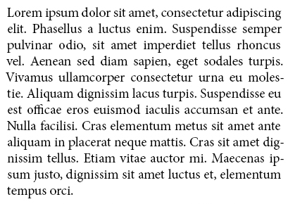
From Cory Nelson, who created the image above:
There is nothing about EPUBs that prevent e-readers from performing this kind of typesetting automatically.
In other words this isn’t a technical issue with the EPUB standard. And yet:
Kindle doesn’t do this.
Kobo doesn’t do this.
Nook doesn’t do this.
This is, frankly, disgusting. These devices are designed only for reading. And they’re making reading harder. Can you imagine making a product that doesn’t effectively serve it’s sole purpose? (Yes, I know this is done all the time. But that doesn’t make it right. Or acceptable. Or any less infuriating. And this is books. Lazy product designers shouldn’t be messing with books and then proliferating their mess across millions of devices.)
The publishing industry should be embarrassed for putting up with this. Amazon in particular should be mortified for selling these devices, if not apologetic. I mean, the world’s biggest book store is making books harder to read. Not. Cool.
Yes, the standard digital annoyances of vendor lock in and DRM still apply in the digital book world. But these are the least of our concerns when the major e-book readers don’t support basic legibility standards.
Hopefully someone figures something out soon because I’m uncomfortably caught between what seems to be an insane act of using vast resources to print a book that’s exponentially larger and heavier than an e-book reader that then needs to be shipped around the world and carried by me, and not being able to read anything on these useless devices.
Some more reading on this subject:
Justifying the Nook: A case for PDF from Cory Nelson.
Publishing: Why Typography Matters from Michael Hait.
How is an eBook like Pizza Hut pizza? from Michael Marcus.
A side note on other formats:
Apple has done a pretty decent job with iBooks, supporting justification and hyphenation. The trouble is, they have their books in skeuomorphic software that shows a stack of pages that never change their thickness, no matter how much of the book you’ve read. And their format is DRM locked to iBooks software which is only available on the glowing screen of the iPad, which is less conducive to reading, while the iPad itself is larger and heavier than any of the e-book readers noted above.
And that leaves us with PDFs, which none of the major publishers are supporting because they’re presumably scared of piracy, and which don’t adjust to different screen sizes.
Update:
Ah, there’s a full screen view in iBooks that gets rid of the silly skeuomophic pages. Thanks for the heads up, Matt!