“Less interface doesn’t necessarily equate to better experience.”
~ Adrian Zumbrunnen
In Deceptive Simplicity, Adrian shares multiple examples of interfaces which undermine the product, limiting user engagement or causing a disconnection with users.
I use the term simplistic in place of simple, to drive home the point that reduction purely for the sake of minimizing the elements of interfaces and highlighting an aesthetic minimalism ignores the fundamentally complex task of delivering value to users. If you’re not considering product purpose, user needs, and actual usage your simple form will lack functional purpose.
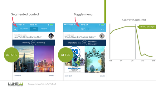
An example of how moving from a visually busy but explicit menu to a dropdown reduces engagement: