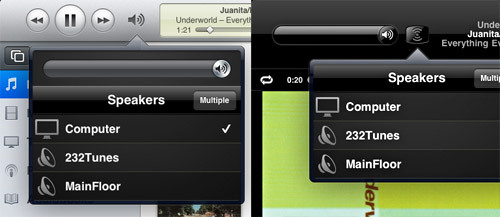
Apple recently released an update to its Remote app for managing iTunes from your iPhone or iPad. One of the key features of this app is the ability to control speakers throughout your home. So, top left of the app, we find the audio sharing icon and dropdown (unfortunately, with a different icon to accommodate for the alternative placement of the volume slider depending on whether you’re browsing your library or looking at the currently playing song).
More importantly, apart from the multiple icons, we find within this dropdown unnecessary complication. Here’s a riveting minute and a half shaky iPhone video showing how these added interactions unnecessarily complicate the use of the app while adding to the development time.
The simple rule being: simplify, especially for the end user.