It’s time for some GapmericanApparel fun. In addition to the brand cheapening grade school logo they’ve inexplicably decided to use, choosing the Canadian store at gap.com actually loads the entire store inside the popup chooser.
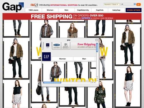
While it sure is nice to see that classy old logo in the top left of the Canadian store, it’s some poor execution on the Web side that allows the whole site to load in a 250 pixel box.
Then again, this kind of poor attention to detail is exactly what I’d expect from a company sporting a logo like their new one. I thought Old Navy was their bargain property, but I guess they’re looking to bring Gap to new lows. Congrats, you’ve succeeded!