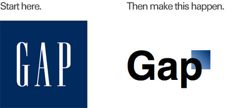
Step 1: A logo refresh!
Sample execution: Take your classy, well established logo and replace the logotype with sterile Helvetica. Shrink the background of your logo so it becomes a handy little square and tuck that sucker behind the top left corner of your wordmark.
To be sure there’s enough contrast between your wordmark and this new dark square that’s obscuring the last letter of your name, add a nice gradient to lighten up the overlapping area.
Step 2: Share this sucker with the world!
You can do a big coordinated effort with press releases, signage and product updates, and so on, but that would imply a professionalism not at all in keeping with your design efforts so far.
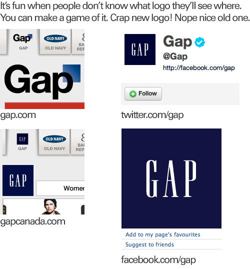
Sample execution: Just drop this sucker on your heavily trafficked US Website and see what happens. You can save the regional website updates, product and signage updates, the Facebook and Twitter page updates to, well, sometime later.
Step 3: Respond to criticism with the nonchalance you applied to all your efforts thus far.
You’ve already shown your disdain for design by releasing this dog on the world, so when the criticism flows in, show how much you value design by inviting your users to fix the problem. After all, why spend money on something that’s just so simple to accomplish?
Sample execution: Write your fans on Facebook and Twitter asking for them to design you a logo for your multi-billion dollar company. Here’s a handy template for you to use:
Thanks for everyone’s input on the new logo! We’ve had the same logo for 20+ years, and this is just one of the things we’re changing. We know this logo created a lot of buzz and we’re thrilled to see passionate debates unfolding! So much so we’re asking you to share your designs. We love our version, but we’d like to see other ideas. Stay tuned for details in the next few days on this crowd sourcing project.