
Will Apple’s Oct 20 Back to the Mac event finally herald the unification of its OSX app designs?
While updates to iTunes over the years have hinted at some long needed aesthetic changes (such as shifting away from the aqua scrollbars), there has been a general divergence between all the standard OSX apps. Even the promised Snow Leopard tuneup ignored aesthetic refinement.
Where we’ve seen gains in this area is with Mobile Me. Compare the long standing atrocity of the OSX Mail toolbar with the latest version from Mobile Me (with Mobile Me on top in the images that follow).

A close up, comparing icons:
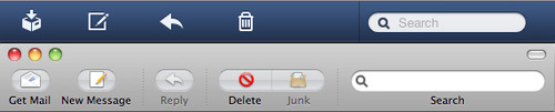
The difference being the icons in Mobile Me are recognizable at a glance as they have their own unique shape, rather than being suffocated by the recessed oval styling that was introduced with OSX Tiger. Removing the oval also has the added benefit of allowing the icons to be a little larger within the same amount of vertical space. Always helpful.
In addition, look at yesterday’s release of the new Mobile Me calendar along with Mobile Me’s address book app.

Consistent across all the apps. (Though the calendar is back to using icons on buttons, they’re much more subtle than OSX Mail’s oval icons.). So, will this style be adopted across the desktop apps? Or is this Web savvy design too radical for your everyday OS?
With the only new OSX feature I’m clamouring for being always on syncing with my iOS devices, and performance still being an issue in many apps (see: iTunes, Time Machine backups, Aperture and iPhoto), it would really be nice if Apple just wowed us with some strong application design and an OS that looked and worked as well as their hardware. It’s been a long time coming.