Every customer who visits your website may be at a different stage of their purchase journey. Whether they are just beginning an information-gathering journey to understand a potential challenge or solution better or have gone through a series of steps along their purchase journey and are ready to buy today, intent plays a critical role in how each user will engage with your content and respond to your offering.
Intent is essential in establishing a connection to explain and persuade towards an exchange between your organization and a consumer, whether on your homepage, an advertising marketing page, or elsewhere on your site.
When we look at a blog and the articles you’re publishing, or other long-form pages or cornerstone content, intent plays into how visitors will react to your CTAs, and how you can best support that person in taking their next step towards making a purchase decision.
One of the challenges businesses faces when investing in publishing longer, information-focused articles or pages on their site is falling into the trap of thinking like a publisher.
A publisher’s job is to grow time on site by offering more engaging content and promoting the consumption of that content, typically encouraging readers to click on an ad or buy a subscription. As a business, your blog is a tool to drive transactions that support your products and services, not your content, and not 3rd-party advertisers.
Learn the best practices that shift a business blog from being content-focused to conversion-focused with this 8 step guide.
In this guide, we highlight ways you can adapt your blog posts and long-form articles to enable those transactions that draw you closer to customers across all stages of their purchase journey. We’ll achieve this by walking through a series of best practices that helped shift one of our customers from a content-focused blog to a service-focused blog, increasing their service engagement, mailing list growth, and deal flow.
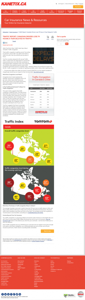
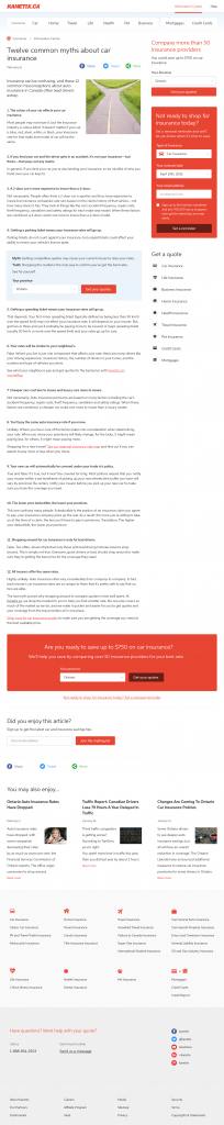
Here’s a look at the overall wireframe of a standard article on our client’s blog
The structure of the blog post was designed to facilitate action by consumers.
As a service provider first (not a news publication), it was critical to guide behaviour toward service transactions. As you scroll the page, various paths to services are highlighted through different calls-to-action (CTAs), with no visible promotional marketing content or other article links until the reader has seen all the service options available.
Let’s examine a version of this wireframe that isolates and highlights the CTAs so you can see how they work together as a user scrolls down the page.
From the top of the page down to the links in the footer, we can map the page by intent.
Let’s review the methodology and detail behind each of the CTAs corresponding to the numbers from the wireframe so you can map your pages by consumer intent.
-
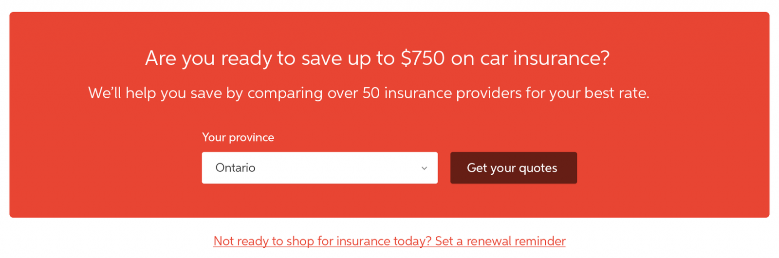
The above-the-fold second column to the right of the article is there for visitors who are ready to buy now. The subtle but consistently placed primary CTA allows people who are there to read to focus on the content. Those prepared to shop can also get started, whether it’s their first visit to the site or they’ve been clicking through a series of articles.
- For users focused on the content, an inline CTA contextualized to the content leads them into the purchase funnel (rather than related content or articles, which move people sideways across the purchase funnel instead of further toward a sale). Remember, you’re a business first; as a primary and secondary objective, help your visitor take the next step, not get lost in more content. Placing other contextualized service links throughout the content encourages people to take their next step towards a purchase as you build trust with the content. Suppose the user continues to be focused on the content. In that case, they can scroll down and read through while secondary CTAs designed to support people with different levels of purchase intent follow along the side:
-
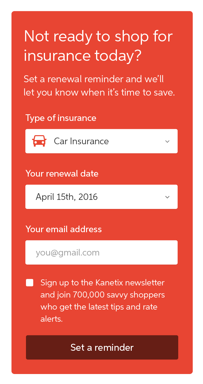
Not ready to buy today? We can share a reminder when it’s time to renew so you can get the best rate.
-
Did you arrive through a search engine to read our great content? You don’t know much about us? Here are all the services we offer to assist with your needs.
- As the user reaches the end of the article, there’s a prominent CTA widget to entice into the purchase funnel, paired with a renewal reminder link if they’re not ready to shop today. This structure has the added benefit of working great on smartphones, where the second column on the right may be hidden or unavailable. This combined end-of-article get quotes CTA and renewal reminder is another view of the content higher in the side column. It’s not too close to being repetitive and doesn’t take away from the content. Still, it’s there, so these critical CTAs don’t get lost on a smartphone while supporting everyone in taking the next step towards a business goal as they finish reading the article.
-
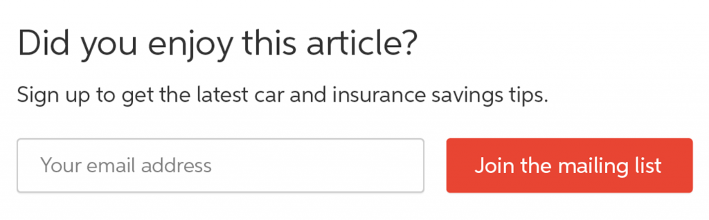
From there, we get to our third level of intent: someone hesitant to shop immediately or share their details for a renewal reminder but has connected with the content. Did you enjoy this article? Sign up for our newsletter.
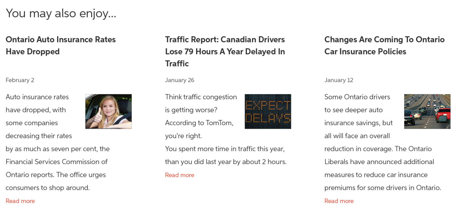
- Not ready to commit to providing any personal information? Here are some other articles you may enjoy. We’ll ensure to use a similar conversion-oriented wireframe structure on each of those as we build trust with you through our premium content.
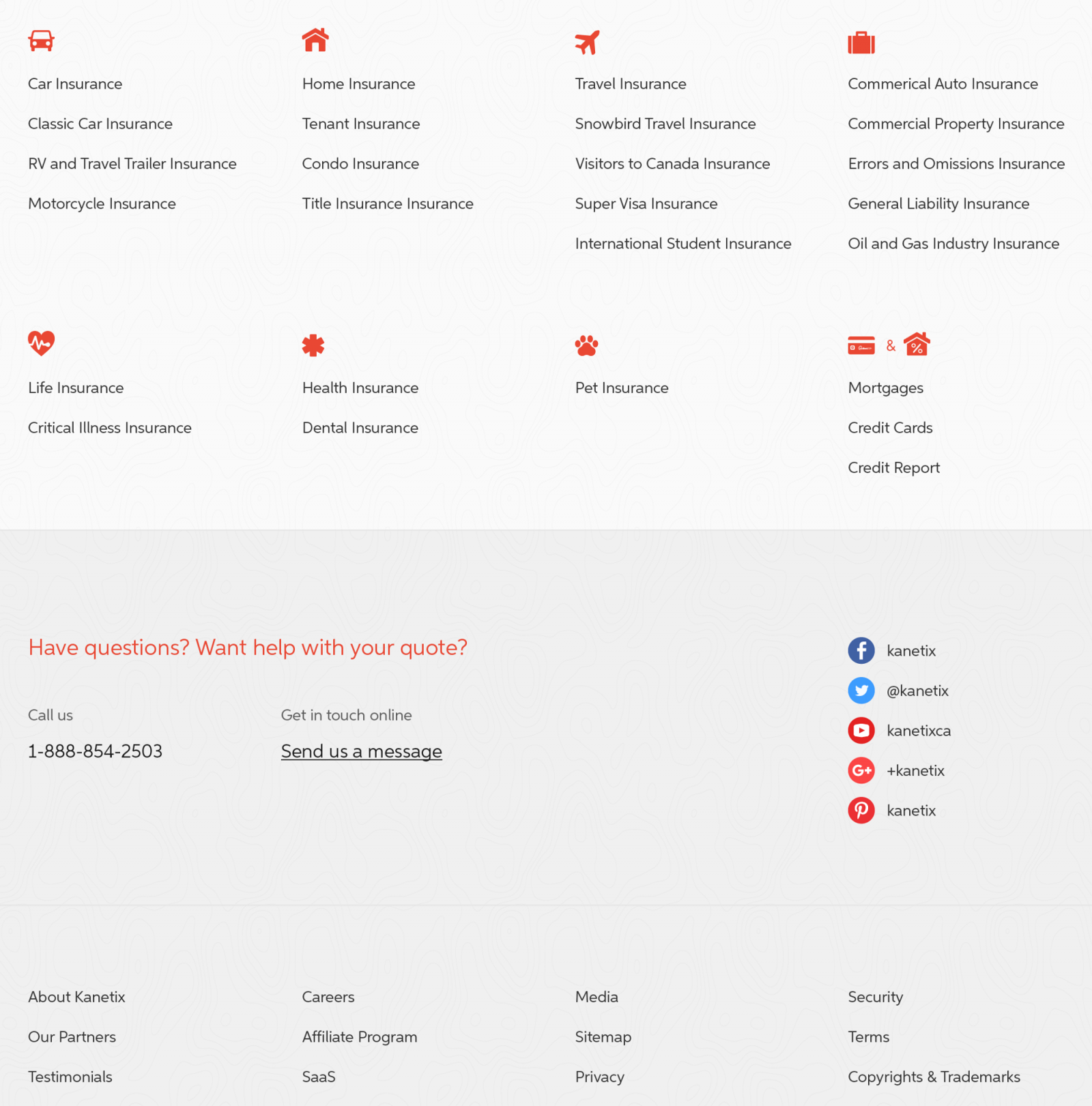
- Lastly, we have a rich footer highlighting services and key links that help illustrate the organization’s capabilities, give everyone a jumping-off point to other aspects of the site, and support SEO initiatives by sharing key content categories and cross-linking on every page. In this case, we also highlight contact information and encourage connecting with the organization by phone, email, or social channels. To the user, the company is a customer-first organization ready to help! Another step toward building trust as the consumer weighs their purchase options.
This progressive, methodical, and courteous approach to providing access to services and information supports users at different stages of their purchase journey.
The journey begins with their arrival on the website from a search engine. It extends to the delightful reading experience in your articles, fast and free quote delivery and seamless purchase process. Ensuring to cover all these levels of consumer intent with your wireframes is a sure way to build towards increased conversions and business success.
Our customer’s results
The improved clarity and accessibility of services, content, and actionable next steps improved deal flow across many articles that were well-ranking on search engines but saw limited service engagement.
A before and after comparison
For this customer, the ongoing investment in content began to drive several improved business outcomes. The mailing list grew, the organic search continued to be a key driver of site traffic, site visitors began engaging with various helpful services that were previously siloed away from the content-focused blog pages, and time-on-site shifted from reading to taking action towards business goals.
In part, these improvements helped bolster Kanetix.ca ahead of their 2018 acquisition by the Ontario Teachers’ Pension Plan.