In order for your customers to recognize the ongoing theme, character, and objective of your business wherever they are, consistency is key. From your logo and identity, to colour selections on screen or in print, colour consistency is an important component to keep in mind when marketing your business.
The approach to take to achieve colour consistency is to begin with Pantone colour chips. Pantone identifies specific conversions for cyan, magenta, yellow, and key/black (CMYK) and red, green, and blue (RGB) based off their original Pantone colours. With these specifications in place, printers can achieve absolute accuracy with the Pantone ink formula. If the printer won’t use Pantone or it becomes cost prohibitive, you can use the Pantone conversions for CMYK to get the closest approximation when printing. An approximation that will also closely align with the on screen RGB conversion from Pantone.
To illustrate how different colour values look on screen vs when printed, here is a precisely matched colour for Pantone 107C as shown in Illustrator when using the Pantone palette chip and Pantone conversion values for CMYK and RGB.
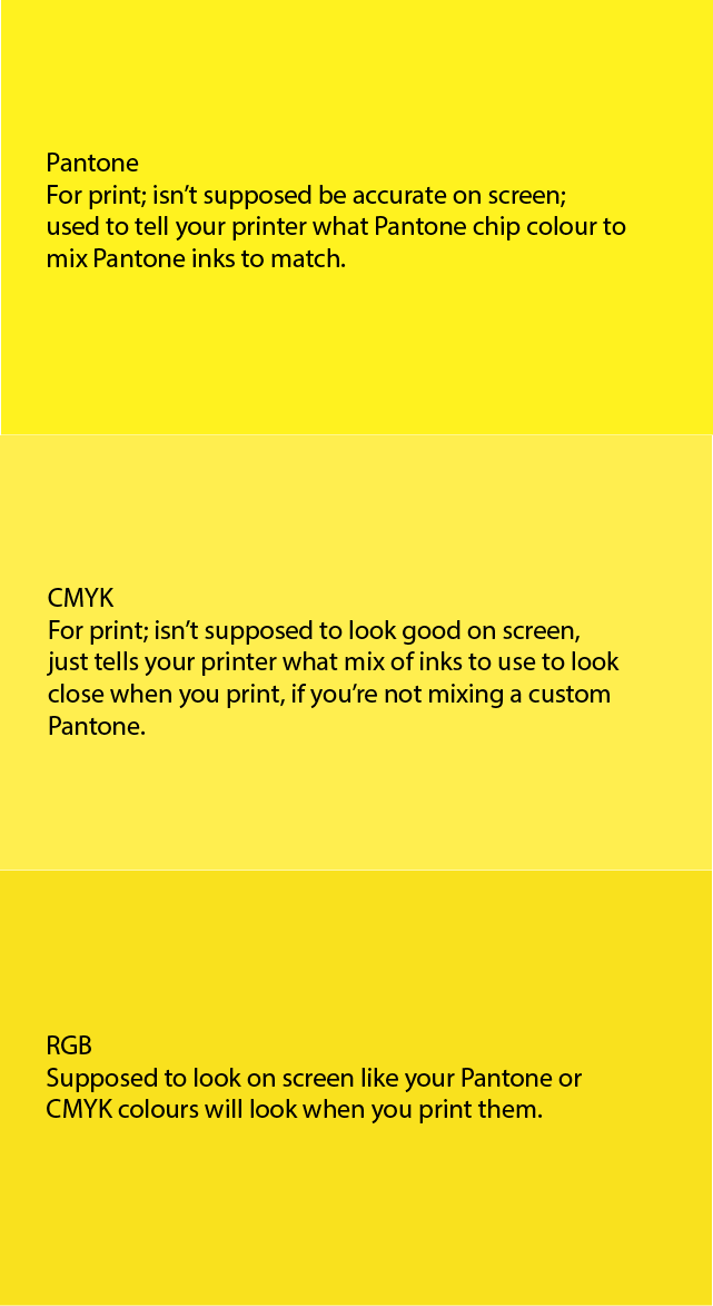
When printed, the Pantone and CMYK should closely match on paper. They certainly don’t on screen. While the RGB should match the printed Pantone and CMYK colours. Therefore, the RGB colour shown on screen is the closest approximation to what the printed Pantone and CMYK colours should look, and you should never colour match on screen to a Pantone or CMYK value, which you can see are brighter and less saturated on screen than the rich colour that should print, as represented by the RGB colour.
From screen mockups to final selections
Trying to match from RGB, you might have a difficult time finding a closely aligned CMYK colour that will match when you print it. And you’ll never have the ease and accuracy of starting with Pantone. However, when you’re quickly trying to mock up new work prior to approval, there’s an efficiency to working quickly with RGB. Experiment with colour options, gain approval, then hold up your Pantone chips to the screen to find a close approximation to your on screen colour. Once you’re there, slight tweaks to the RGB values to match the Pantone conversion guidelines will get you a final colour you can trust.
While it’s not an inexpensive process, in that you’re buying Pantone chips, confirming values, and making sure this is handed off/used for printing, this is the way to ensure colours across various media align.
Of course, different screens have different colour profiles and brightness, so your RGB values will never be consistent across different types of screens, but you will have colour consistency across all the media you control.
But I can just convert the Pantone chip in Photoshop to CMYK.
Sorry, no. You can’t trust conversion values on screen by converting Pantone swatches to RGB/CMYK in Illustrator or Photoshop. You’ll need to use the conversion formulas from Pantone and manually identify the RGB/CMYK values.
Converting Pantone swatches to RGB/CMYK in Illustrator/Photoshop does not provide accurate colour conversions.
For example, if you switch your Illustrator swatch from Pantone 107C to show as RGB, you get the values of 255,242,31. The values in the Pantone Color Bridge are actually 249,225,30 which, on screen, is noticeably deeper and more red compared to the canary yellow of 107C on screen, which is, of course, closer looking to the printed Pantone swatch.
The sooner you check those Pantone formulas, the better.
The sooner you make your colour choice from Pantone based on whatever you’ve shown the client for approval, the sooner you’ll be able to ensure your RGB/CMYK values are aligned and avoid added work.
When we’re doing mocks, as a last step of approval we’ll select the Pantone value that closely approximates whatever the client has seen, make the minor adjustments to the RGB values on screen or CMYK if there’s a print element, and confirm the approval once again. This is essential because anything already produced must be updated to the final values in order to match across print and digital.
Consider it this way: if you design a whole slew of digital components (website, social logos, ads, and so on) and you haven’t yet chosen a Pantone colour to match your on screen RGB, when you finally choose the Pantone colour, if there’s a noticeable difference in the RGB values, you’ll have to adjust all the colour values across all the already produced digital media. Yikes!
End your colour guesswork
All you need to end your colour guesswork is this Pantone Color Bridge set. Have at it!