Simplicity comes in many forms.
Reducing distractions, including providing too much content or too many calls to action, helps people focus on the task at hand.
And allowing the content that is there to be seen, especially on mobile, is an important balancing act between copy, images, and screen height.
But let’s look at how Apple has taken the wrong approach to these tenets with their new mobile menu at Apple.com.
Reducing distractions
Yes, removing content from an interface simplifies it, allowing the user to focus. But if that content is vital, the choice to omit the content, even temporarily, can be more detrimental than having it on screen at all times.

Where to next?
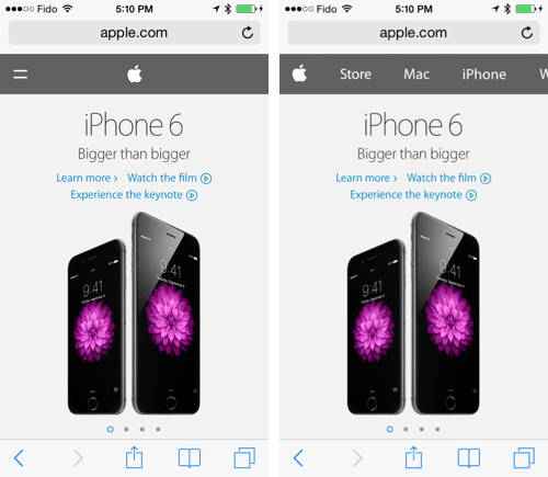
This is especially vital on Apple’s homepage, because there are really only three links on it:
- The menu reveal button, which is a nonsensical equals sign.
- The apple logo, which just refreshes the page.
- One product hero image which links through to a product you may not be interested in.

Saving space on mobile
Sure, mobile menus are often a distraction on an already too small screen, but when the header to toggle your menu is the same size as the menu itself, you’re just adding needless clicks.

Apple did make a unique choice here in opting for a horizontal, scrollable menu over a stacked menu which would have taken up the full screen. And, hey, it works, so embrace it. More on that below.
Charming interactions
You can argue that the reveal of a hidden mobile menu can benefit from a nice animation, rather than unceremoniously snapping into place. But when that animation makes your site seem unresponsive due to a long delay between the time you press the open button to the time the menu slides down, you’re just increasing the frustration level for folks who are trying to get to the information that matters to them.

Combine these things together and now you’ve created tedious work for the end user, with no benefit whatsoever.
So how can Apple address these issues?
Given Apple’s choice to go with a long horizontal menu, the simple option would be to just always show it. This saves time, effort, and provides valuable information on a homepage which has almost no information on it, all within the same space that the current header takes up.
Here’s how this can be done quite easily:
- Remove the equals sign.
- Begin the menu with the Apple logo (still doubling as the Home button).
- Make sure the menu’s spaced in a way that you hint at additional content to the right, so people understand there’s more content they can access.
Like this:

Presto: a simplified menu, half the height of the current one, with all the same content the current full-height menu sports, always showing and ready for action.
And the added benefit: now the mobile menu on Apple.com subtly reflects the menu bar on OSX.

It’s a minor change, that would make a whole world of difference, as this comparison highlights: