Design is about communication. And effective design doesn’t bewilder or misdirect. Symbols and images have the ability to clarify, but in the worst case they may completely obscure what you’re trying to communicate.
Case in point, EA’s current home page for The Sims:
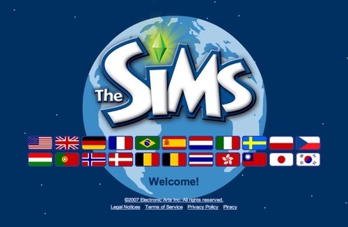
With this design they’ve managed to turn a a language selector into a debate about nation. Canadians and Mexicans are not represented by these flags. What do the Spanish speaking contingent of North, Central, and South America click on? The flag of Spain? Customers in Quebec are to look for the flag of France? In the best case, this design is tedious. In the worst case, it’s offensive.
An incredibly poor design decision that would have been more inclusive, but still unclear, with the use of a globe, and solved completely with a language selector (barring any sales based regional requirements, which opens up a whole other issue of whether or not they support North American Spanish or French, etc).
Update, Jun 4:
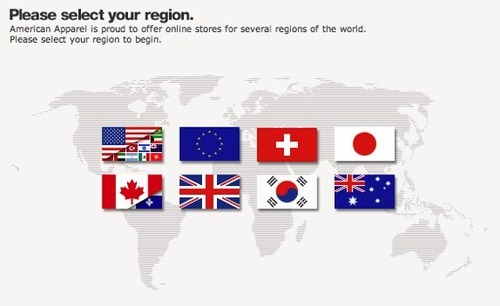
Just few days later, and I’m at the American Apparel online store. Now this is how you do it right with flags if you’re focusing on region, but not language:
Update, Jun 22:
And here’s yet another reason not to use flags as a landing page language selector: imagine if this was Apple’s landing page.