Geoff Teehan shared a great post last week on iOS 7’s woefully unclear shift key, titled Affordances Matter.
While I appreciate that iOS 7.1’s update saw the shift key match the colour of the rest of the keyboard when it’s turned on (everything goes white), rather than changing to another shade of grey as in iOS 7.0, Geoff’s absolutely right that this is not clear enough for users to understand when the shift key is active.
Let’s explore this in more detail.
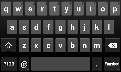
Android 4.4’s Current Keyboard
As Geoff pointed out, Android solves this by actually changing the keys on the keyboard. Personally, I find this practice of changing all the keys on the keyboard quite jarring. Particularly because this change happens so frequently (including every time you start a new sentence) in order to highlight the capitalized first letter of the first word before shifting to lower case for the rest of the sentence. Here’s how that shift looks every time you start a new sentence:
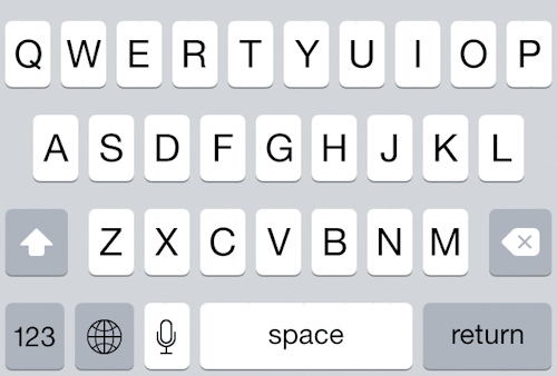
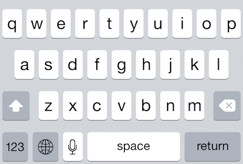
iOS 7’s Current Keyboard
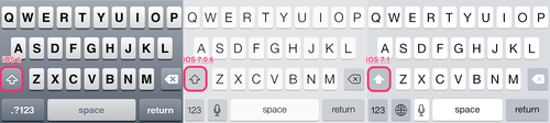
However, it’s clear that iOS 7’s more subtle approach is not enough. Here are the current states in iOS 7.1 for lower case, shifted, and caps lock.
The iOS 7.0 keyboard, by comparison:
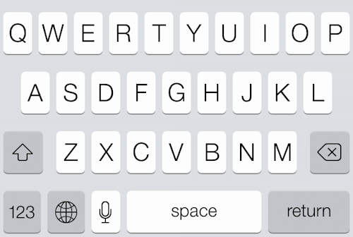
Neither of these is clear, and both suffer from odd choices, including the removal of the outlined arrow from iOS 7.1, and the lack of clarity between shift and caps lock in iOS 7.0. More importantly, in both cases, there’s a lot of effort required to understand whether or not that shift key is on or off.
Geoff’s Proposed Keyboard
In Geoff’s article, he worked through to this proposal, which maintains Android’s shifting keys and reverses the shading of the shift key to imply it’s a button being pressed to activate it, but still leaving out the hollow arrow for the unpressed key:
Lee’s Proposed Keyboard
I think it would be enough to retain iOS7’s three states: grey, white, and underlined white (for caps lock) along with two visual adjustments. First, some reverse shading to imply the key is pressed down (as Geoff introduced). Second, returning to the use of an outlined arrow to imply off and a filled in arrow to imply on (which is how the shift key looked on previous versions of iOS, as noted by Sean O’Sullivan).
These two visual additions would eliminate the jarring adjustment of all the keys jumping from lower case to uppercase found on Android, while keeping the more easily read all caps letter keys we know and love from our physical keyboards.
Here’s a look at the minimalist approach I’d prefer: inactive grey, with an outlined arrow vs a depressed active white shift key with a filled in black arrow.
But Matt here at Say Yeah is still not comfortable with this, instead preferring more distinction between the white active shift key and the white default keys, which are white and all caps at all times. Matt’s thoughts:
Consistency is fine (white to match the other keys), but not at the expense of clarity. By making the shift key distinctly different from the rest of the keyboard, it becomes obvious what’s happening so you don’t have to think about it.
Previous to iOS 7.1, the shift key lit up in bright blue. Something along those lines is Matt’s preference. Filip Truta agrees, stating in his article The iOS 7.1 Shift Key Is a Disaster:
iOS 6 was spot on, change wasn’t necessary
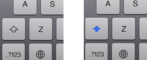
Above: In iOS 6, the Shift key is gray when disabled and blue when enabled, which is much easier to discern than with the iOS 7 keyboard.
What’s your take on how Apple should solve this notable issue?