
One of the primary goals in our design work is to understand how a user can best flow through an app, from the moment they dive in to the moment they’ve accomplished what they set out to do.
While navigating through a digital product, it’s this sense of place that allows you to focus on the task at hand, and not worry about next, previous, or missed interactions.
Depending on a user’s goals, and the tasks required to reach those goals, the path through an app may lead across multiple screens. Our efforts always focus on first reducing the depth and complexity of this journey and then helping users understand their place throughout the journey.
The understanding of place is vital for people navigating a digital world, where anything is possible and disorientation can become a profound distraction.
In the digital world, your sense of place is defined by product structure, layout, navigation, movement, and layers. And this is further enhanced or detracted by any competing elements outside of your product’s control, including an operating system, other application windows, and physical buttons.
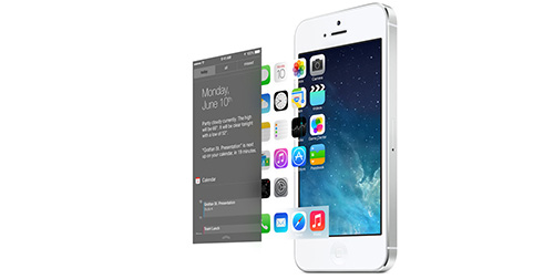
It’s no wonder then, following Apple’s reveal of the latest version of its mobile operating system yesterday, that we’re excited about designing apps for iOS7.
With this iteration of the operating system, we’re starting to see long standing issues addressed. For example, easier, more intuitive access to sharing and settings that otherwise took you out of your task flow and threw you onto a whole other path. This is all part of a new visual language throughout the operating system that will help users feel grounded and focused on the task at hand, even if they are required to jump from app to operating system and back again. In Apple’s words, “a new structure that brings clarity to the entire experience.”
Specifically:
Distinct and functional layers help create depth and establish hierarchy and order. The use of translucency provides a sense of context and place.
John Gruber elaborates on this:
In hardware, design is limited by physics: weight, density, size, connections, seams. Software doesn’t face those design limits. The old design of iOS 6 took advantage of that lack of limits, to its detriment. In iOS 6, you open a folder on the home screen, and linen is something you see underneath. You pull down Notification Center, and linen is something see over. It’s both over and under. Hardware doesn’t work like that, but software can, because software can show you anything, conceptual logic be damned.
The design of iOS 7 is based on rules. There’s an intricate system at work, a Z-axis of layers organized in a logical way. There is a profound reduction in the use of faux-3D visual effects and textures, but iOS 7 is anything but flat. It is three dimensional not just visually but logically. It uses translucency not to show off, but to provide you with a sense of place.
iOS 7 is available to developers now and will be released to the public this fall. With 90% of compatible devices now running iOS 6, you can be sure the majority of users will be upgrading by year end.
Ready to talk iOS 7 and what’s next for your app?
If you’re looking to bring fundamental product strategy methodologies and execution to your team, we’re here to help.