Nigel Smith recently wrote a great article noting the design history of Team Canada’s iconic jerseys, chock full of fun little anecdotes. It begins with:
In 1972, the most famous Canadian sports uniform — a design icon — was created by John Lloyd, a transplanted Englishman with no knowledge of hockey. (He was more into yoga.) Lloyd is completely uncelebrated for his extraordinary contribution, and he never mentioned it. This work is an example of the power of good design, and here’s how it came to be.
The whole article is worth a read, but here are some choice highlights:
Vickers and Benson were given 24 hours to come up with a name and sweater design.
They were originally to be called the NHL All-stars, but Terry O’Malley at Vickers and Benson worked to position the series as “not a series between Russia and the NHL, but Russia and Canada.”
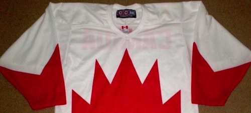
O’Malley on the mad rush and work by John Lloyd:
Everything was moving at warp speed. We not only required the sweater, but we needed home and away versions by, you guessed it, tomorrow.
The incredible John Lloyd had bought two large red and two large white sweaters. He cut out the now famous stylized maple leaf in red and in white. He then stitched the red on the white jersey for home and reversed the process for the away.
Defying convention: There is no central crest on the uniform. There are also no numbers on the sleeves.
All this derived from a Canadian flag which was, at the time, just 7 years old, designed by a man who had only been in the country for 2 years, and stitched by his wife, Michelle Lloyd, who went on to co-found Club Monaco.
Awesome.