I’m really digging Mattan Griffel’s minimal homepage review at GrowHack.
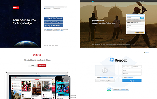
The two key takeaways from the homepages of some of the fastest growing companies on the web are:
- There is a single, clear value proposition.
- Signup is the only action.
No content for people to see and share. No menu or other prominent calls to action. It’s just, “Here’s what you get from us. Sign up if you want that.”
This is scary for anyone to consider, particularly when you’re launching a new product with the mindset that content converts and you have to prove your product to people.
And I love Mattan’s rebuttal of the typical concerns people voice when considering a minimal homepage.
When I tell people these things they often complain: “But everyone knows Twitter and Facebook, so they don’t have to explain what their product is about. No one has ever heard of [my startup] so I actually need to explain it to people.”
You are wrong.
Maybe you and I already know what Twitter and Facebook are about, but we’re not the people they’re trying to get to sign up on their homepage. 2.4 billion people use the internet and more using it each day. Believe it or not, there are still people on earth who haven’t heard of Twitter or Facebook. Those are the people these homepages are trying to convert – not the luddites who refuse to sign up (trust me, Twitter and Facebook stopped caring about them long ago).
Read Mattan’s full post for more on content sharing and other assumptions people fall back on when launching a new product.
And, of course, if you’re making any changes to your signup flow, be sure you’re tracking conversions based on where users are arriving from, how they fit into your target audience, whether they’re new or repeat visitors, and what they do once they hit your homepage.
Not sure about any of this? We can help.