Tumblr’s just updated their Dashboard blog post icons.
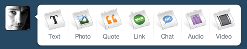
Here’s what they looked like on Monday:
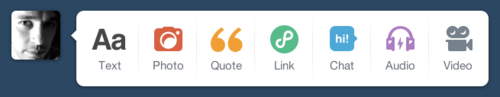
And here’s what our Tumblr Dashboard looks like today:
Wow. What an improvement!
So, what makes these new icons so great? Well, at a glance recognition, that’s what.
Previously, there was a relatively clear distinction in the colour differences for each post type. Tumblr’s done well to keep this colour palette so, not only do the icons continue to be visually distinct from one another, but they retain the same colour for user’s who identified post types this way. In other words, the new icons are still familiar to long time Tumblr users.
However, the previously-used fancy torn paper motif was a needless distraction with its high realism, off balance angle, and consistent shape, ultimately creating a pattern that made it difficult to recognize the icons themselves.
In this case, the apparent decision to simplify meant removing the paper, gradients and drop shadows, so now each of the icons has a distinct shape from one another, at a glance.
Though I could quibble about the inconsistent weights (some icons appear needlessly heavier than others), complain about the vertical alignment (they do look like they’re all centred vertically, but why make some taller than others so there’s no rhythm or consistency to the icons), and wonder about the decision to illustrate the too similar Photo and Chat shapes (that’s a funky chat bubble which is very similar to the camera, making it harder to differentiate between the two), overall this is a great improvement.