Content Hinting
Users are familiar with the idea that they can scroll down to reveal additional content that is hidden off the screen. But it’s not expected that a page might load in the middle, allowing the user to scroll both up and down for additional content.
In our example below, we want users to know that they can scroll up to reveal previous dates in the month. A simple way to achieve this goal is with content hinting—revealing a part of the hidden content to imply that more content is available just off screen.
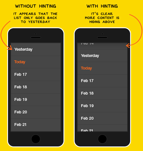
If we just started with Today, or Yesterday as the top row, there is no indication that a user can scroll up to reveal previous dates, even if that functionality exists.
By cutting the February 14th date in half, we’re giving the user a hint that there is additional content hiding above that’s just an effortless swipe away.
Hint at unexpected interactions
Hinting at interactions helps users quickly understand how to use your product in unexpected and rewarding ways. This quickly turns new users into more engaged power users who understand and utilize the full capabilities of your product.
Looking for more product design insights?
Sign up for our mailing list to be the first to learn insightful tips, case studies, and more.