It seems a lot of companies are interested in hearing what people have to say about their websites. I get that. We have a Feedback button to the left for just that reason. Whether it’s to give constructive criticism, point out a feature we should have on our blog or the Toronto Events Calendar, letting us know if something’s not working as you’d expect it to, or even to congratulate us for doing a good job. These are all great reasons to solicit feedback and I can say we really appreciate people taking the time to contact us with whatever’s on their mind.
Now, the more interactive your site, and the more people you have using it, the more important a good feedback strategy is. And it’s important to solicit not just general feedback, but contextual feedback as well. For example, we have our Say Yeah project within Get Satisfaction (see that Feedback button again) which is for this blog but, even though the Toronto Events Calendar is at the same domain as the blog, we’ve created a separate project because it’s contextually different content and a different application. Mixing the two of them up would create a convoluted mess of feedback, issues, and feature requests between unrelated projects (the blog vs the calendar). This would be a mess for us and a mess for people trying to use the different sections of the site.
Getting beyond the reasons for surveying, let’s look at the tactics. You’ve got the Feedback button (hey, it’s still there on the left) and you’ve got third party survey sites that you can push people to, either through contacting them directly or showing them a survey request while they’re browsing your site.
So, how’s that work? You’ve got your user kicking around your site. Maybe they’re even in a specific section of your site that you’re looking for more info on. Are people enjoying the content there? Is there something missing from this area of the site? Whatever your reason, now that they’re there, it’s time to hit them up with a survey request so you can improve the user’s experience.
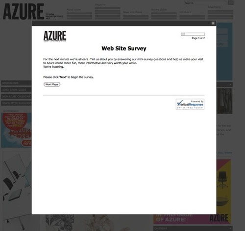
What’s so great about this is how interested Azure is in getting my feedback. Let’s take a look at that intro paragraph:
For the next minute we’re all ears. Tell us about you by answering our mini-survey questions and help us make your visit to Azure online more fun, more informative and very worth your while. We’re listening.
Well, I’m excited. This is a company that really cares. They want me to enjoy my time on their website. Fun and informative, they say. And, most importantly, they’re listening. Unfortunately, I had no idea what was going to come ‘Next’ so I closed that window. But if Azure is still listening, here’s what I have to say to you:
- If you want my feedback about how great your site content is, and how fun and informative your site can be, how about not slamming a huge giant popup on top of the same site that I browsed to with the hope of finding some great content. Guess what you just did? You ruined my fun and prevented me from enjoying your content. You know what that does? It pisses me off. And you know what I did? I closed the box and left your site. And I haven’t been back. And now I’m getting mad writing about your ridiculously foolish marketing behaviour.
- But wait! There’s more. Not only did this obnoxious box fill my screen while I was trying to browse your site, but it popped up within a minute of me landing on your homepage. I literally just got there. I have no idea what you have to offer because I haven’t even clicked on one link. No chance to look around, much less do anything fun or informative and you’re popping up a survey request that inevitably would ask me all sorts of questions about the experience I’ve been having on the site. Could this be more foolish? No. No it couldn’t.
Now I know you didn’t intend for your interest in me to lead to this, but when you’re effectively blocking my entry to your retail store while asking me to talk about how great the store I haven’t yet stepped into is, well, I’m going to walk away perplexed and probably spend the next week and a half telling everyone about the bizarre experience I just had. Wouldn’t you?
Not to pick on Azure alone because about 95% of the survey requests I see are pretty much the same. Azure’s just done a particularly impressive job of entirely covering their website, rather than the standard smaller, distracting popup. Something along the lines of this:
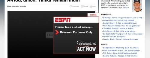
Not too bad compared to Azure, covering a much smaller area of my screen, but it animated from the left all the way over the body of the article I was reading and stopped right in the middle of that article. How is that helpful ESPN? Well, at least they’re interested in my opinion as well. Or are they? Their survey is for some kind of research project. Safecount? Act now? Wtf? What is this survey for, research, security, or the next Ed McMahon draw? How utterly confusing. CLOSE, indeed! Idiots.
Alright, so what’s left? Kind of a simple idea here but, how about if you ask me to do a survey, are explicit about what it’s for, and the request doesn’t interrupt the content I’m trying to get to. Possible? Why, yes, yes it is:
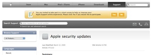
Apple’s survey request is clear (“…take part in a short survey to help us improve our Apple Support…”), it’s contextual (about Apple Support and in the Apple Support section), it doesn’t obscure any page content (they simply inserted it just below the menu, pushing down the regular page content a few dozen pixels, not covering it), and it showed up after I had a chance to actually browse their Support section and read some articles.
So, there you have it. Simple, clearly written, non-obtrusive survey invites are possible, even if you’re trying to say more than what a nice Feedback button hanging out on the left side of your website says.