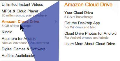
Ben Kamens of Khan Academy has posted a lovely review of Amazon’s user-friendly and fast mega dropdown.
Ben’s article includes comparisons to standard dropdowns and Amazon’s ‘cheat’ (pictured above) which is to include a triangle beginning with the mouse pointer and continuing to the top and bottom of the dropdown menu where you can run your mouse without having the menu switch.
Interestingly, the further you are to the left of the main menu selector, the larger your triangle and the less likely you’ll trigger a menu change as you scroll to the right to make your selection from the submenu.
It’s so nice when some code hacking makes a simple, long-standing web device work better for the end user.
As Ben says:
I’m not ashamed to copy Amazon. I’m sure this problem was solved years and years ago, forgotten, rediscovered, solved again, forgotten, rediscovered, solved again.
And here’s his jQuery plugin to help keep it solved.
Update
Kevin Ballard adds:
The part that gets me is this is how the Mac menubars have worked since, well, forever.
Update 2
Actually, OSX’s behaviour is different than Amazon, as it uses a combination of intent and speed to maintain your submenu selection. You have to generally begin moving horizontally towards the submenu (though taller submenus make this less of a requirement. ie, a long list of Bookmarks in Safari), and you must maintain a certain mouse speed or the selection will change and the submenu will close.
Amazon’s ‘triangle’ is more forgiving in these ways.
While both Amazon and Apple reset to selecting from the primary menu if you move your mouse backwards, which I’d imagine is nice for most people, provided you don’t have a jittery mouse hand.
And now we’re getting concerned about how much time we’ve been playing with submenu interactions this afternoon…