One of the more challenging areas of interaction design is conveying how things will work. How do you show user input and system responses over time, with static imagery?
When a visitor taps this button, what happens next?
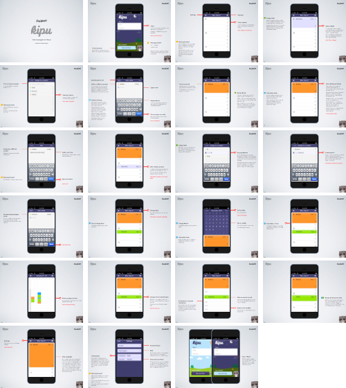
At Say Yeah, we illustrate how a user navigates and interacts with an application with an interaction flow document that takes the reader through every interaction in the application. It’s effectively a site map that has been zoomed in to focus on a single view/page at a time to better highlight features and interactions within each individual screen.
This document has the following four uses.
First, we use it internally to identify areas of the app that may have been overlooked (missing steps in a flow, alternative messaging or alerts depending on user inputs, and so on), or have been broken by scope changes.
Second, it gives the client insight and understanding of how the application is going to work, rather than just how it looks.
Third, it’s an ideal communication tool from designer to developer, as it gives a full view of the application and how we as designers envision it will work.
Finally, the presentation of this document encourages review of all the expected use cases and helps ensure all stakeholders are on the same page.
For a complete view of an interaction flow, download our Kipu iPhone App PDF.
Focused on a single transaction.
Each page describes exactly one interaction. There can be various call outs to other areas within the view, but there is only one transaction. This ensures that it’s easy to see what the user input is, and what the system response is.
Linear, rather than interactive.
In the past, we’ve made these documents interactive, to allow the viewer to tap on various elements and see transitions and screen updates. The issue with an interactive document is that we are often presenting a subset of the application, usually a single workflow. People get excited and start tapping around on things that are not wired up and it feels like the design is broken. A linear flow on the other hand just walks through step by step so there’s no place to get lost.
One piece of the puzzle
An interaction flow is just one tool that we use to help explain and excite clients and developers about the potential of their product. Over the coming weeks, we’ll share more about prototyping and getting your product to market.
Follow the blog, or sign up to our mailing list to be the first to hear about these insights.
Product strategy as a foundational skill
If you’re looking to bring fundamental product strategy methodologies and execution to your team, we’re here to help.
