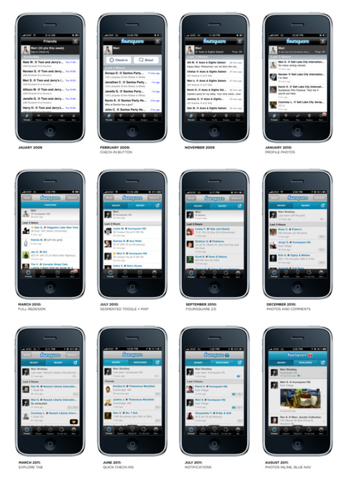
Foursquare’s Mari Sheibley talks about the evolution of Foursquare design on the iPhone, from Jan ‘09 through to August ’11:
One of the great things about working on one product is the ability to iterate; the bad thing is you never feel like you’re done.
When foursquare started there was no real visual design on the app. Naveen was coding it up alone and he used all native Apple UI elements. I was helping out on the side and slowly we added custom elements and branding and for SXSW 2010 we did our first visual pass at the design. At that point I was doing everything, and it showed. One person can only do so much. Now we have a talented group of UI and UX designers and these days I mostly work on the iOS app.
We just put out a new build complete with a new blue navigation bar, photos inline, single tap cells and a newly designed check-in detail screen. I’m really proud of this current iteration of the app and can’t wait to see it continue to evolve.
I find it revealing that the article begins with “the bad thing is you never feel like you’re done” while talking about the process, evolution and latest iteration, Mari finishes with “I’m really proud of this current iteration of the app and can’t wait to see it continue to evolve.”
It’s that closing sentiment that really excites us and drives us to working long term with our customers. We thrive on the idea of delivering an iteration of an app that gets out in the wild, invites use, feedback, and let’s us discover right along with users unexpected ways to interact with the app. This is what we need to help iterate based on business needs and real world use. There’s simply nothing static or forever about what we do because every click leads to new insights. There is no complete. There’s only each iteration and what that teaches us. That’s exciting.