Microsoft Home Magazine is a blog formatted magazine, focused on showing visitors how to get the most out of consumer based Microsoft products. Each day, the editors of the magazine add new articles, videos, or tips for their users.
The challenge presented with the original site design went beyond aesthetics. Understanding the different profit centres within Microsoft and the need to drive traffic to these areas of Microsoft.com, organization of content, including site navigations, content categories and page layouts, needed to support the dual roll of engaging the consumer with valuable content while driving sales. This meant guiding content development to ensure that marketing prompts throughout the pages of the site were relevant to the article the customer was reading, all while creating a consistent view and easy access to profit centres through the targeted Downloads and Products sections on each page.
We also worked to increase customer interaction with Microsoft with a new Show & Tell section (now renamed to I’m a PC), the addition of article commenting, and encouraging feedback throughout the site.
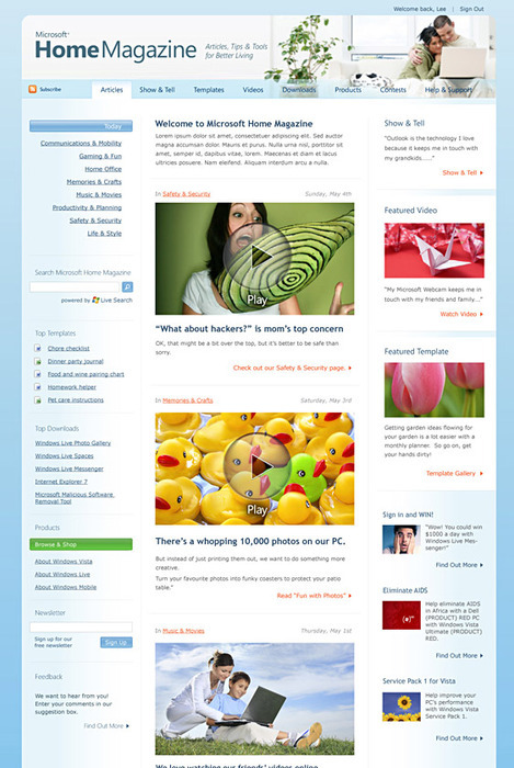
The landing page shown below highlights the latest additions to the site, allows users to browse directly to articles, explore other sections of the magazine, download MS Office templates, and search or navigate to other areas of the site.

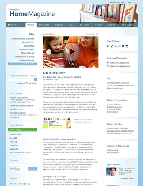
Most articles on the site contain a variety of media, including template downloads, videos, and more. Users can share each article with their friends using a variety of methods, including connecting to social networking sites. Users may also contribute comments within each article, or share their own related stories and templates.
Article view:

What we worked on:
- Content and user engagement strategy.
- Site structure and navigation.
- Site and article design.