I’m generally a big fan of Pinterest for creating collections of inspirational and aspirational things. But I’m trying to figure out if I’m just noticing how broken Pinterest is because I’ve been using it more, or because their relatively recent design made the upload process so terribly confusing.
Let’s take a look.
If you’re uploading something directly to Pinterest, there’s a big ol’ plus button top right of the site.

That’s fine. It loads an overlay that lets you choose from a number of upload methods.
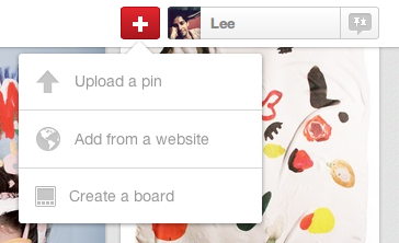
But it’s not very contextual if you’re working on viewing and collecting pins on a particular board.
So let’s say you have a pinboard you want to add a bunch of stuff too. In fact, I’m going to create a new board just to collect a bunch of great stuff quickly and easily:
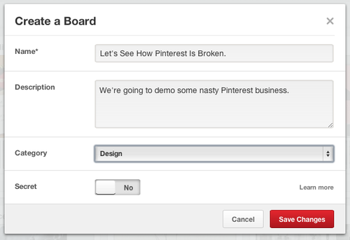
Now I’ll jump to that board real quick so I can just add a bunch of stuff to it.
Conveniently, Pinterest puts a big ol’ button here that says “Add a pin”.
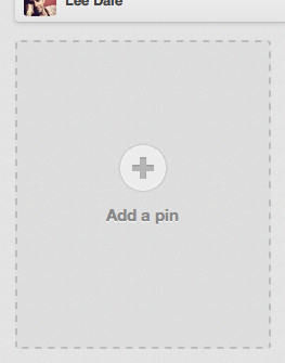
I hit that “Add a pin” button, and get a standard upload overlay:
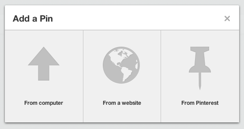
No problem. I’ll quickly add an image from my computer.

And here’s where the trouble begins.
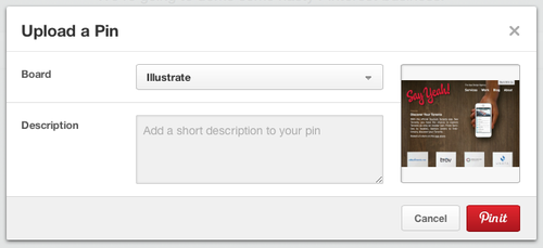
I’m in my board “Let’s See How Pinterest Is Broken.” And I clicked the “Add a pin” button in that board, but my default Board is whatever the last board I pinned to is. In this case: Illustrate. That’s not terribly convenient, because now I have to change the dropdown, even though I selected a specific board to pin to. But things get worse from here.
I add my short description, even a URL in the only field I can type in:
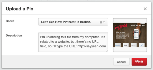
Great. Pin it!
Okay. It’s saving. And when it’s finished, this dialog pops up for about 2 seconds:

Looks good! It says the pin uploaded. And to the right board.
But when that dialog disappears, I’m left with this:
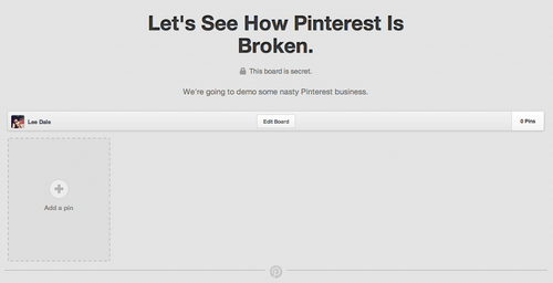
There’s no pin!
The trouble is, the board page doesn’t refresh or update in any way to show that any activity has occurred. It’s terribly confusing, because your first assumption is that the pin didn’t actually upload, despite the rather brief 2 second message that says it did.
Now, maybe the process of browsing to a board and hitting the ‘Add a pin’ button is an edge case. Perhaps the vast majority of users use a bookmarklet or upload from somewhere else on the site, other than on the board page itself, but the trouble is there’s that big giant “Add a pin” button on every board page. And if you’re going to have a button which emphases a method of performing a process, you should take care to make sure the process is thought through with care.
Having to change the board name when you’re pinning to a specific board and then seeing no visual reference to a pin uploaded to that board once the process is finished shows a lack of consideration from one of the web’s most popular sites.
To top it off, that URL I added in the Description field isn’t clickable. Though there’s a URL field if you edit the pin, it’s empty. And there’s no way to fill it when you’re adding a pin. You have to go to the pin after it’s uploaded and edit it.
For a site that’s all about sharing and clicking, that’s terribly inconvenient and points to three glaring issues with the upload process that begins with the “Add a pin” button.
Be sure you don’t make the same careless mistakes with your app.