
There are a lot of UX and aesthetic gripes that you could point out when discussing iTunes. A few items solved with iTunes 10 and a number of new ones introduced, but let’s focus on a nice little touch relating to iTunes player views.
Previous to iTunes 10, you had two window states that allowed you to control the music that was playing. There was the full window (with various options on how you displayed your tracks and albums (song list, album list, grid, or cover flow). Here’s how that window looks:
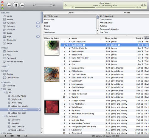
Big and expansive, it provides you with access to all the functionality and information regarding your library, but if you’re not browsing your library, it takes up a ton of desktop realty and can also take up substantial amounts of RAM when it’s in full view. Minimizing this window (by hitting the yellow button, top left) saved your RAM, but meant you were stuck with keyboard keys and context clicking on the dock icon to pause, forward, or rate the track you were playing.
Which brings us to the second option, the mini iTunes window. You can toggle between the full view above and the mini window by hitting the green button, top left. And the mini window looks like this:
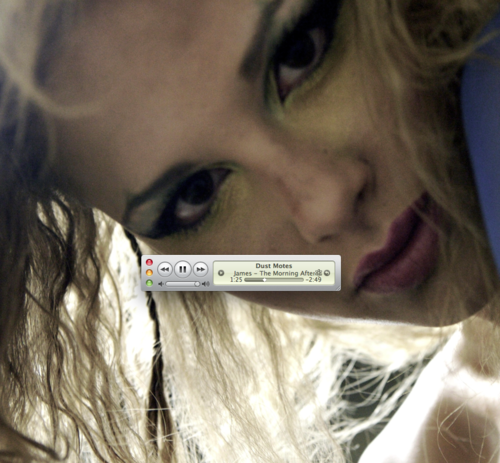
I’ve personally never liked this window. It doesn’t really offer any additional control over the keyboard keys and your view of the music and feels too sterile on my desktop.
So, what else is there? Well, in previous versions of iTunes you could of course see your album artwork in the full window and, should you choose to do so, you can click on it for a larger view, which looks like this:
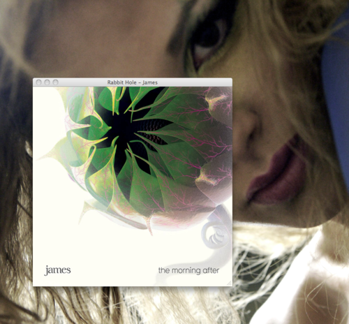
Not much to this window, other than enlarged artwork, which you can close, minimize, or expand to take up the full height of your desktop. However, in iTunes 10, enlarging up the artwork from a song you’re currently playing now looks like this:
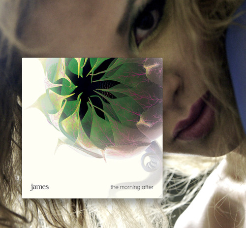
A little cleaner album view without the title bar on the top. But the best part about this is when you rollover it:
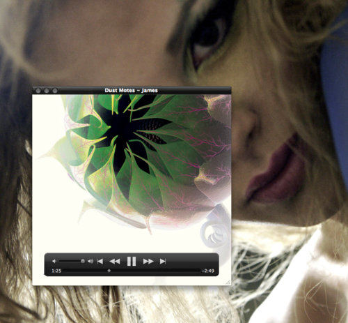
Now in the same style as Quicktime X, rolling over what you’re actively playing gives you access to not just the title bar, but a full set of controls. Better yet, this window shows whatever song is currently playing, not just a song from the album you originally clicked on. This means, as the song changes and as you move from one album to the other, this artwork will reflect the current track and its artwork, and these controls.
So now you can leave this artwork window open on your desktop, close the main window to save space and RAM, all while retaining the same controls as the mini view in a much nicer artwork view.
So what’s missing
Unfortunately, the album player window is not persistent. If you close iTunes and reopen, only the main iTunes window will load.
Part of not being persistent means there’s no quick link in the Window menu. While the main iTunes window and mini-player are both identified as “iTunes” in the Window menu, the album player is only identified when it’s already open. This means the only way to open the album player is to click on the artwork of a playing song from the artwork view in the Library browsing column on the left of iTunes. Personally, with the album artwork now sitting right next to the track listings in the main iTunes window, I hardly ever turn on the artwork view in the Library browsing column, so it’s not a simple process to get the album player up when it keeps closing.
Library column artwork on the left and artwork right next to the track listings seems redundant, and closing the larger view on the left means you can see more of your playlists:
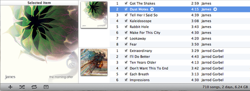
Finally, on the control overlays over the album art itself, there’s plenty of room over the time remaining to drop in shuffle, repeat, and genius controls, which would round out the functionality of this mini-player.
So far this new player view is a really nice addition to iTunes, and cleaning up these few items will help make sure it gets regular use. Now it’s just too bad this James album isn’t half as interesting as its cover.