A wonderful exploration from Henrik Eneroth on the limitations of the current standard Web browser layout (tabs across the top, running left to right) when used on hi-res, wide screens.
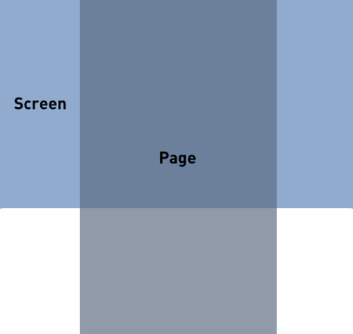
This reference image sums up the dilemma presented when all of your controls are in thin little rows at the top of the page and yet the pages of the site you’re browsing are generally designed at 960 pixels wide on your 1200+ pixel wide screen. Henrik very appropriately name this image ‘mismatch’.

Read on for some proposed solutions from Henrik, with a particular focus on Apple’s new full screen view in OSX Lion. Apple’s been touting full screen as a primary feature of OSX Lion, but they seem to have rather lazily implemented this view in Safari.