It’s generally understood that the traditional way of to write out an address is as follows:
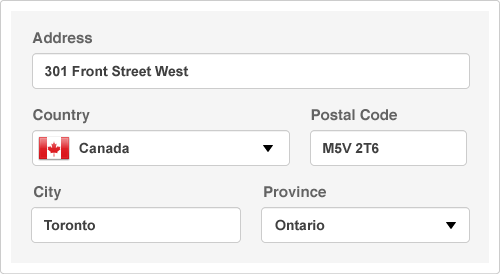
301 Front Street West
Toronto, Ontario M5V 2T6
Canada
This is all well and good when mailing a letter, but it presents a problem of hierarchy when used in a web form. The specific issue is with the order of the province, country and postal code.
Here’s how you’d generally find these fields organized in a standard checkout form.
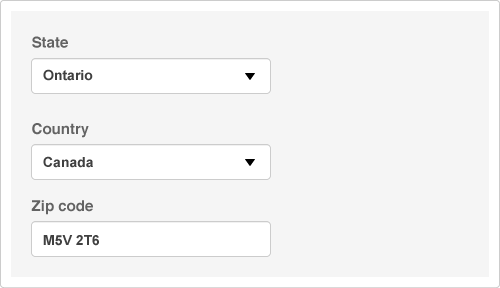
So what’s the problem? For starters, every country has different regions (provinces, states, neither, etc.) but the user is being asked to specify which region they live in, before they’ve even decided what country they live in. This creates an issue where the user has to click or tab down past the region field, choose a country, then navigate back up to select their region.
We can make this process a whole lot simpler for the user by putting the country field before the region field, allowing the user to specify their country first. This may then update the form (using javascript) to display the applicable states or provinces for their country. This also gives the us the opportunity to update field labels to their proper values by country. For example, in Canada we have provinces and a postal code in place of states and a zip code.
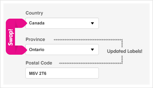
Just like that we’ve made things a little easier for users. We can take it further, if you’re feeling a little more ambitious. It’s possible to determine the user’s city, province and country using their postal/zip code. To do this, you’d simply put the postal code before the city, province and country fields, and then evaluate it with Javascript which can automatically populate the following fields.
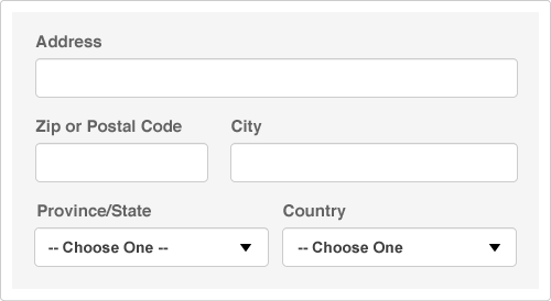
If you’re dealing with a North American audience, we can easily determine if a user is from Canada or the USA by detecting whether their postal/zip code begins with a number (USA) or a letter (Canada). This may throughly confuse your international shoppers, as people from the UK would be told they’re from Canada, but if you’re running a local delivery service, this would be useful.
Let’s focus on the Canadian postal code system first, because it’s nicely structured, and neat how much information you can gather from it.
Using the first letter alone, we can determine what province a user is from. In fact, the entire M designation is for Toronto alone. So if a user enters M, we know immediately they’re in Toronto, and can fill in the city.
Other locations are simple to figure out as well. We’ll simply need to reference the first 3 characters of the postal code, for example, L3Y & L3X are both postal codes for Newmarket.
A simple javascript object could be referenced to return the relevant data about a postal code. This process is nifty, and saves the user time when purchasing a product from your website. You can hop over to Wikipedia and check out a listing of all the active Canadian postal codes, and their respective provinces and cities.
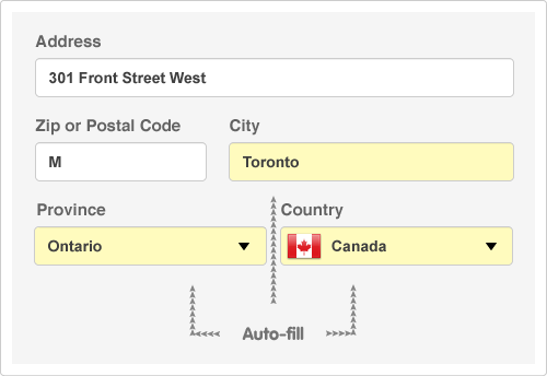
Zip codes in the USA don’t seem as structured. For example, a zip code with the first digit of 1 could be the state of Delaware, New York or Pennsylvania. We can’t determine what state the user lives with a single digit alone, however, we can decypher that they live in the USA, so we can set the country, and update the region list, changing the label to “State” and populating the drop-down.
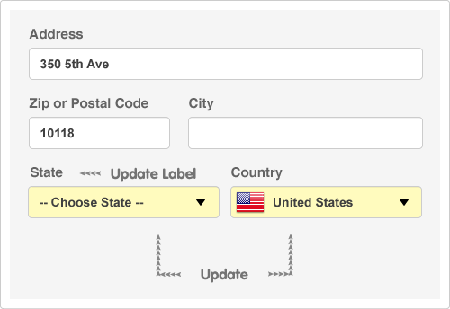
I don’t know enough about zip codes, but there is likely a pattern in the first few digits that would allow you to calculate what state the user lives in. You can find out more about zip codes at Wikipedia.
It is possible to use this technique for Canadian and American customers when you’re also serving international customers. The best way to do that would be to ask for the country first, then the postal code. That way you can be sure you’re suggesting the right information for the right country.
Be aware, if you decide to use a technique like this on your site, it’s very important to allow users to change your suggested responses. Why? The trouble with making a system smarter is that smart things often make dumb mistakes. There are going to be fringe cases that you can’t account for. For example, H0H 0H0 is the postal code for Santa Claus, but if you punched in H our system would assume you live in Quebec. These fringe cases drive users insane Make users upset when they can’t manually override them.
My personal encounter with such a system involves the Swiss Chalet online ordering system. For some reason, it thinks I live in Stouffville (which I don’t), and I can’t change it. I’ve learned to live with it, since my food always arrives, but the first time I ordered, it was very confusing and frustrating that I couldn’t set my city to Toronto manually.
It’s these little touches that will help make the experience of using your website a whole lot more exciting (yes, exciting!!) for your users. When a user gets to think less about using your site, they can focus a lot more on getting value from your content and services.