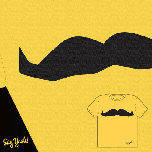
Well, this is unexpected. I submitted a design for the Movember Tshirt contest this morning only to have it rejected on the grounds that:
Your idea could use a little more work to be up to the standard that will give it the best shot.
I’ve always wondered why most of the Threadless tees are overly detailed images more about storytelling or ensuring a high percentage wearable hipster friendly humour than visual impact, now I know: they don’t dig minimal.
Following Threadless’s recommendation, I’ve submitted the tee for critique.
My submission is as follows:
Bold and confident, you can promote the mo year round with this golden nugget, complete with positive affirmation. Just say yeah to mos!

So, too minimal for you? Have your say!