We’ve been curating a Pinterest board featuring Login/Signup forms for a few weeks now to track how things are shaping up with social login buttons, user names and passwords, security, and error handling.
We’ve also been keeping an eye on Tim Bray’s efforts to make logging in safer and simpler. He’s advocating two-step authentication now and a future where you don’t need a user name and password to login. That would be great, but we’re not there yet.
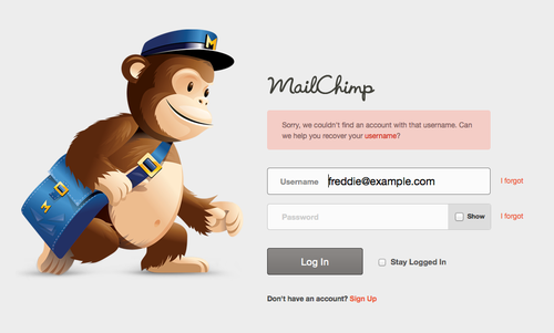
And today I was led to Mailchimp’s article outlining some key findings based on a few login page redesigns.
So let’s look at some of the most important login screen considerations.
From Mailchimp:
The engineering team, ever mindful of security, argued that being generic about username and password errors makes it harder for bad guys to guess usernames by pounding the form with random words or email addresses.
Most login forms give you a generic error along the lines of “Your username and password is incorrect.” Engineering has long held that this is to protect the site from hackers, but it means your user doesn’t know if they have the wrong password or the wrong user name. The result: more users having to go through a tedious password recovery process.
We’ve had this security argument with engineering teams in the past. Mailchimp won the battle for their users—and we encourage you to fight for yours—because letting users know exactly what’s wrong with their login credentials far outweighs any security considerations.

On the subject of social login buttons, Mailchimp has this to say about adding Facebook, Twitter, and other login buttons to login forms:
As you add login buttons to a page, you also add decision points for users, while creating visual complexity in your design.
And:
If you’re using Twitter and Facebook for signup too you’ve got a bigger problem. A user’s credentials are then bound to another account on another service that could be canceled at any time, breaking access to your app without the user knowing. Unless you require a username and password for your app, then pair that with credentials from a social network, you’re creating opportunity for confusion and frustration for your users.
Mailchimp says only 3.4% of their users would login via the Facebook or Twitter logins. Though I’d love to see some stats from both equally busy and smaller sites regarding social login button usage in 2013 (Mailchimp’s article dates back to last autumn), there’s no doubt there’s wisdom in a number of the considerations Mailchimp points out.
That said, avoiding social logins altogether isn’t necessarily the only or best option, with some sites now choosing to hide their own user name and password fields to reduce complexity and focus more on the social login.
Yet, if you read Mailchimp’s article in full, they continue to argue against any use of social logins, noting additional concerns around brand dilution, managing user accounts, and consumer confusion.
In fact, Mailchimp goes on to state that they didn’t want to trust the safety of their customer logins to a provider like Facebook or Twitter. They’d prefer to be responsible for that security themselves. And maybe they have the engineering chops to handle that, but I’d bet Twitter and Facebook have a much better handle on security than most web apps and other sites that require login credentials.
Even still, let’s consider the process social logins afford vs traditional user/password combinations. With a social login, you can leverage your existing login to your daily obsession (Facebook, Twitter, Google, etc) and you simply authenticate (and can revoke at any time) the site you’re browsing. If you stay logged in to Facebook, for example, you never have to type a password into your browser, provided the sites you visit support Facebook logins.
Here’s Tim Bray with more details:
One of the key advantages Federated Identity (represented by social login buttons) is cutting down the number of times people have to type in passwords. There are a bunch of good reasons for this:
- Every time it happens, that’s another chance for password theft.
- We don’t want to get people into the habit of typing…passwords in here and there; that habit is a great big red target sign saying “Phish me!”
- Typing passwords all the time is a painful user experience, particularly on mobile devices.
- The easiest way to reduce that pain is to use a short, simple, password, probably the same one you’re using everywhere including on your easily-hacked kid’s-Little-League site.
Security isn’t just who holds the passwords, it’s also how your users interact with them. Social logins can help improve security overall by making user’s lives easier and less reliant on (often simplified for convenience) passwords.
In the end, your login page should be reflective of your user base and their goals, which means considering all of these factors.
If you’re not happy with how your sign up and login forms are performing, we can help you measure, refine, and improve this process for your users so they can focus on using your app.