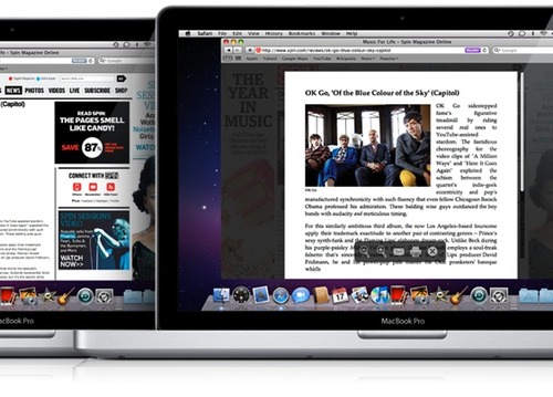
Update, October 10, 2012: Safari and Safari Reader on the desktop and mobile have addressed all the issues noted below. And with that, we’ve updated sayyeah.com so all the articles sport justification, with hyphens if you’re viewing in Safari or on Firefox. Very cool.
Proponents of Web font options have been given a boost with @font-face, Typekit and now Google’s support with the Google Font Directory (of course, in Google ubiquitous Beta). However, the greatest barrier to Web legibility is not typefaces but rather screen size.
With the adoption of standards-based Web browsers across Apple, Android, Symbian, Windows Mobile 7 and other portable devices, you now have to design sites for screen sizes ranging from 3″ (or smaller) to 30″ and everywhere in between. On the larger size, the standard generally remains suitable for a maximum 1024 pixel wide screen, but as we head down to the iPad sized 1024 pixel (landscape) and 768 pixel (portrait) on just a 10″ screen, those 23″ 1024 pixel websites now become very small. Even moreso with all the clutter of ad space, menu columns, and more. To this end, we now see Apple’s introduction of Reader in Safari 5, design to get rid of “annoying ads and other visual distractions from online articles”. Presumably this will filter down to their mobile devices as well, which is where the real benefit will be found. However, there’s one major issue with the Reader implementation.
Highlighted even on Apple’s promotion page for Reader in their side by side comparison, sure Spin’s ads have been removed allowing you to focus on the article, but they’ve move from a left justified rag to full justified text, sans hyphens. What this does, as shown in the image below, is create absolutely brutal spacing and, in their own example, even create single word left justified lines. This isn’t easier to read, it’s a disaster.

Here’s the same article zoomed in so you can get a better feel for this:

But, hey, this is encouraging. The idea of focusing on legibility over style and glitz is an important step in allowing for increased Web based consumption no matter the device (desktop or mobile). So what’s next? Well, optimizing type for multiple screen sizes and hyphenation.
Which points to Blain Cook’s excellent “Beautiful Lines” article. From the article through the comments there’s a great discussion on maximizing type for variable screen sizes rather than fixed width designs and supporting hyphenation, which is currently a flawed implementation at best. So, where’s that encouragement? Well, if Apple insists on full justification for Reader, it won’t be long before we see a solid implementation of hyphenation in Safari which ideally will filter across to other Browser’s. More from W3C on hyphenation.
Here’s an excerpt from Beautiful Lines as shown in Safari:

To give you a feel of how broken Safari’s implementation of hyphenation is, here’s what happens when I copy and paste a small excerpt from the Beautiful Lines article:
jus ti fi ca tion and hy phen ation and drop caps and in dents
As you can see, when I paste, the hyphen that was originally in the sentence is removed but multiple spaces have been inserted.
In Firefox there’s only one hyphen in the entire article, on a word that is longer than the page width, which of course makes for similar awkward spacing to the Spin article above.
Here’s the same excerpt from above, as rendered in Firefox:

Of course, given this lack of hyphenation in Firefox, the same citation copy and pastes as expected:
justification and hyphenation and drop caps and indents
So here’s to Apple getting the discussion moving on this, which I expect will pick up dramatically if we see Reader filter down to those 100 million+ mobile devices they’ve sold and where isolating the content on their mini-screens will become a real priority.
If you’ve got any other resources or discussions in the area of hyphenation on the Web and designing for multi-screen size layouts, share away!