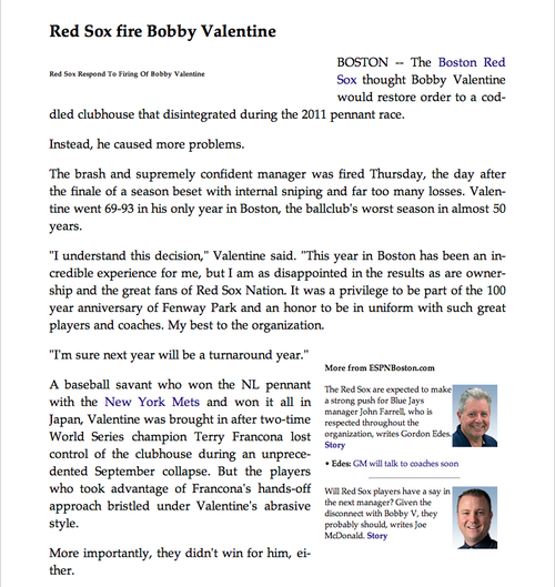
Back in June of 2010, I wrote about a series of steps being taken to help improve readability across the Web. This ranged from font services such as Typekit to CSS support of hyphenation.
At the time, some of these improvements were in their infancy and a little rough around the edges. Safari’s Reader, for example, was a Safari 5, desktop-only feature that removed the clutter of multi-column, ad-filled, multi-page articles. Now it can be found in Safari on iOS and on the desktop.
More importantly, Apple has very pleasantly moved from the same justified nonsense you’d see on a Kindle to type that’s justified with hyphens. This means we’ve gone from this type of barely readable Reader layout:

To a much more readable:

(Unfortunately, it looks like Spin has overridden the default reader settings and the original OK GO article pictured above is a little fubared in Reader.)
Safari has also corrected an issue with hyphens from back in 2010 where copying and pasting a passage left the hyphens and spaces where the text wrapped to a new paragraph on the original website.
And now with these improvements to reading in Safari, it’s with great pleasure that we’ve now updated this site so each article is justified with hyphenation, whether you’re using the full website on Safari or Firefox, or Safari’s Reader on the iPad. (Alas, Tumblr’s mobile version and Safari’s iPhone Reader don’t support this, and Chrome doesn’t know what hyphens are.) Otherwise, enjoy!