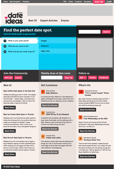
With the identity sorted, it was time to attack the sparsely designed, text heavy Date Ideas website. To combat this, we wanted to carry over the bold colours, type and style of the logo.
We did this in two ways:
1. We made sure colour became the hallmark of the site, with space for large photos, bold ratings highlights, and vivid activity areas, such as the homepage date planner, even giving a touch of colour to all the white that was there before.
2. We used Typekit to pull in a typeface that’s closer to the look and feel of the logo than any websafe typefaces. While the site looks fine without Typekit, the addition of the more stylized typeface makes it that much more fun.
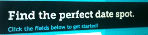
Without Typekit:
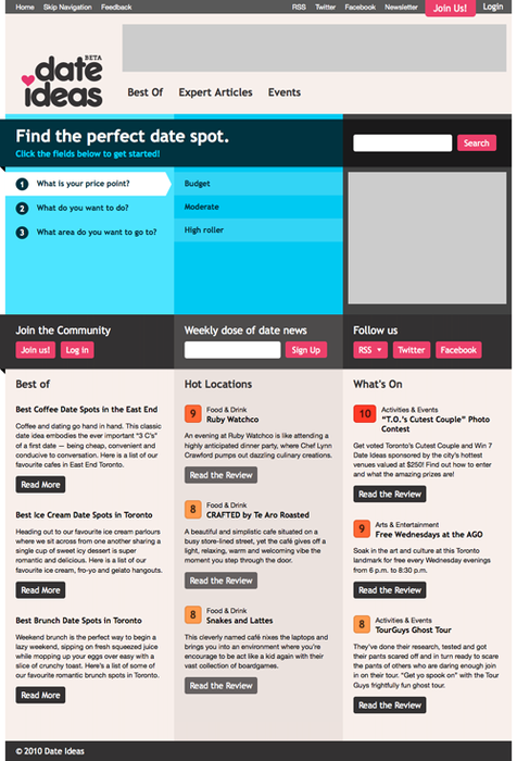
With Typekit: