While we’re plugging away on the next update to the Events Calendar, I thought it would be fun to walk through the process we took while designing the new time entry elements used when adding or editing an event in the calendar.
The current method of entering the start and end time for events is cumbersome, at best. No less than 12 combo boxes are used to convey a start and end date and time. We can do better.

We tinkered with a few ideas, including a UI similar to Time Pickr, but it just lacked that the elegance we were looking for. I took a break, and upon returning there was an email from Lee with a rather cryptic looking idea which set things back in motion.
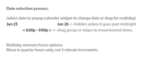
After some back and forth to figure out exactly what he was talking about, we were on to sketching.
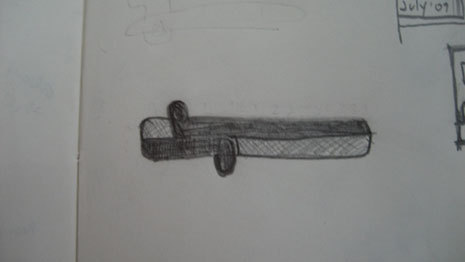
An early idea, with multi line date selection, was rather impractical.
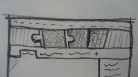
That’s more like it.
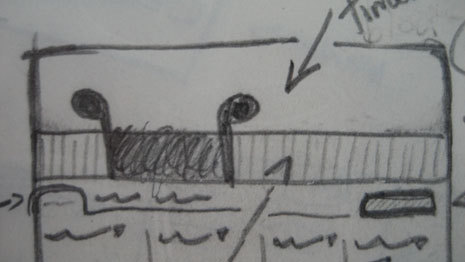
Oh, handles on the outside, I like that.
Next I hit the computer (not literally), and started with some basic mockups to figure out how it should look. Several hours and iterations later we’ve got something. Excitement!
Some additional modifications and a trip out to Zipcar.com to see how their time slider worked (yes, they’ve built something similar, who’d have known?) And we ended up with this:
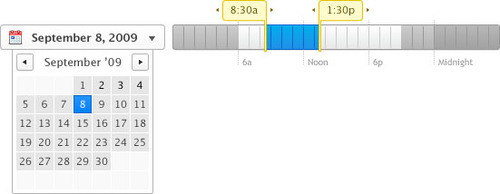
A few key points of interest
- The grey areas indicate when the sun is down, between 9:00a-6:00p. (Summer night time at least, it’s depressing to think about night time starting at 5:00p. Damn winter.)
- The time scale is 30 hours, rather than the standard 24 hour day. Why? Well, sometimes we like to party until the wee hours, and it made sense to allow people to schedule events from say, 9:00p to 2:00a.
Excited? I know I am! While we’re still in development on the final solution, I have high hopes that this new method for selecting time will hopefully provide everyone with an easier, more efficient and even fun (!) way to input their events into the Events Calendar.