Previously, I wrote about website surveys and the right and wrong way to display such requests on your website. What I didn’t talk about was when to ask someone for their opinion, which is equally as important as how you ask for it.
The issue with when to ask for user feedback is based around the customer’s goal of browsing your website. Interrupting that process is, at best, disconcerting and, at worse, annoying. In other words, if you care about me as a customer enough to ask for my opinion, at least have the courtesy to ask for my opinion when I’ve completed what I’m trying to do.
We collectively suffer from the same issue with phone based customer support centres. I’ve actually been in the middle of troubleshooting an as yet unsolved problem with a customer support agent and been asked if I wanted to hear about a new promotion. You’re trying to up sell me while my service isn’t working!? How incredibly inconsiderate. And annoying.
So, the task at hand. I’m on your website to find something, buy something, or look for information. You’d know this if you were tracking my clicks. A series of searches. Browsing a product list. Configuring a computer. All of these things are easy to recognize and track, and you should not be interrupting these tasks with survey popups or redirects.
If I’m not involved in such a clearly identifiable series of tasks on your website, then your website is either disorganized, broken, or I’m not worth being surveyed. If I am involved in such a series of tasks, the time to ask me to fill out a survey is when I’ve completed what I’m doing, either by moving on from an identifiable goal (moving from shopping to searching) or, better yet, clearly having completed a goal (such as completing a purchase or adding a comment to a support forum).
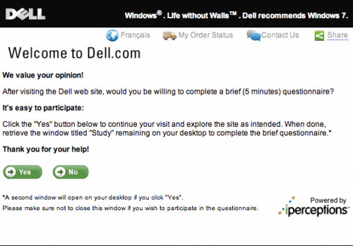
The time to ask me to fill out a survey is not after 2 minutes of browsing. Not after 10 random clicks. And certainly not after 1 click and with a message asking me to take 5 minutes at the end of my website visit by following a little birdy, or some suitably inconsiderate trick I must perform in order to help you out. Case in point, Dell Canada:

What does “retrieve the window titled “Study” remaining on your desktop” even mean? Are you installing software on my computer? Why am I retrieving something at all. You’re already asking me to spend 5 minutes of my time to help you.
Not only that, but you’ve interrupted what I was trying to do with all of this gibberish and, on top of it all, are now asking me to make sure I retrieve something after I give you my money. What? Oh wait, I missed the asterisk at the end of this meandering, unclear request.
If I spent the 2 minutes to read all of this (because what I was *trying* to do is clearly not at all important) and got past the incredibly poorly worded confirmation that says “Thank you for your help! Yes. No.” (Again, what?) I’d see the asterisk leads to an explanation of this retrieval business: “A second window will open on your desktop if you click “Yes”. Please make sure not to close this window if you wish to participate in the questionnaire.“ Holy crap! “Powered by iperceptions.” So they’re the idiots that came up with this? Man.
This is lazy web development. Lazy programming. Lazy copy writing. Lazy everything. Serves me right for trying to price check against Apple’s new Mac Mini Server. (The Mini being substantially cheaper than the Dell I priced out, which included no server software, btw.)