Heat map
A heat map is a way of visualizing user data or statistics. Heat maps typically offer visualizations of where people stopped scrolling or clicked on a webpage.
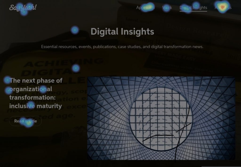
This example heat map highlights where people have clicked on a page. Warmer colours represent more clicks.
This method is one way of better understanding user behaviour on a website or digital product.
Product teams can use this data to create stronger page hierarchy, emphasize key areas that are receiving less user attention, or understand what other areas of the page could benefit from richer content or a link to more detailed information.
CategoriesProduct strategy